
CLIENT
Samsung C&T Fashion Group.
MY ROLE
UX Consulting
Samsung C&T Fashion Group.
MY ROLE
UX Consulting
UX Research
SUMMARY
YEAR
I consult QRS service in Samsung C&T Fashion Group, which serves customized premium suits.
YEAR
2017

PROBLEM STATEMENT
“ QRS Service has very complicated work process with various system and roles. Also, there are a lot of paper work separated with system. It needs organized process from salesman to worker at factory until deliver qualifed products for customers. ”
PROJECT GOALS
1
Support communication between roles
2
Optimization system for providing customized infromation
3
Expand function to help workers real-time information
4
Minimize complicated system, Upgrade usability and learning
APPROACH
︎Check Overall QRS Process
︎ Analysis based in Real-Voice from field
︎ Proceed workshop gathering each role to discuss common issues
︎Check Overall QRS Process
︎ Analysis based in Real-Voice from field
︎ Proceed workshop gathering each role to discuss common issues
RESEARCH METHODS

Field Research

In-depth Interview

Heuristic usability evaluation

Workshop
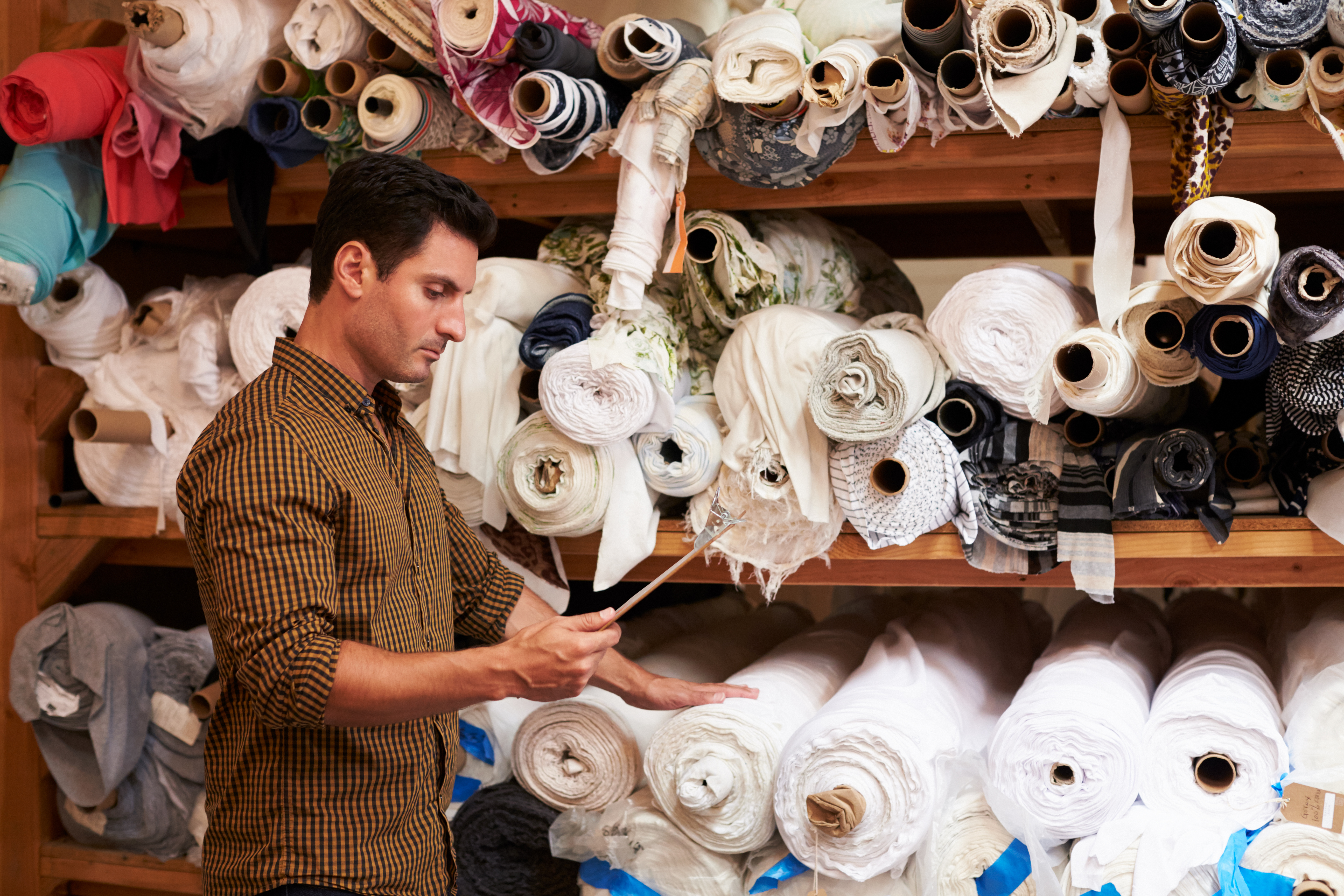
INTERVIEW OVERVIEW 🔎️

1. INTERVIEWEES : Total 12 interviewees (MD, MR, Factory Workers)
2. INTERVIEW PERIOD : 2017.06.08~2017.06.16 (8 days)
3. INTERVIEW METHODS : In-Depth-Interview, Shadowing (Obseravtion Research)
4. INTERVIEW POINTS :
✔︎ Check Gaps between QRS Work process and real work
✔︎ Check main communication points each roles
✔︎ Observe user behavior about using system through task demonstration

WORKSHOP WITH CLIENTS
PAIN POINTS & KEY FINDINGS
︎ Occur frequent offline communication through various channel
︎ Use optimized personal work files
︎ Task patterns to perform returning checking and reworking
︎ Occur frequent offline communication through various channel
“We have to communicate with other roles about inquiries about reducing schedule, email notice, low stock of fabric, check emergency tasks.”
︎ Use optimized personal work files
“I rely on my own work files : client schedule notebooks, sales report excels, order management excels.”
︎ Task patterns to perform returning checking and reworking
“We check production status and customer’s body information every single time at factory ”
︎ Use system only to perform an administrative task because users don’t recognize system function
“We feel very difficult and complicate to use system even though system serves various function.”
︎ Use system only to perform an administrative task because users don’t recognize system function
“We feel very difficult and complicate to use system even though system serves various function.”
SOLUTIONS
1
Minimize Tasks : reduce unnecessary and repeated work
2
Block inefficiency and error main causes by system
3
Overall situational alarm
SOLUTION1| MINIMIZE TASKS : REDUCE UNNECESSARY AND REPEATED WORK
Personalized Dashboard to assist Collaboration
Deal with issue through sharing detail tasks status and assistance
SOLUTION2| BLOCK INEFFICIENCY AND ERROR MAIN CAUSES BY SYSTEM
Reposition sorted important information and grouping association
System Going With Workflow
Reposition sorted important information and grouping association

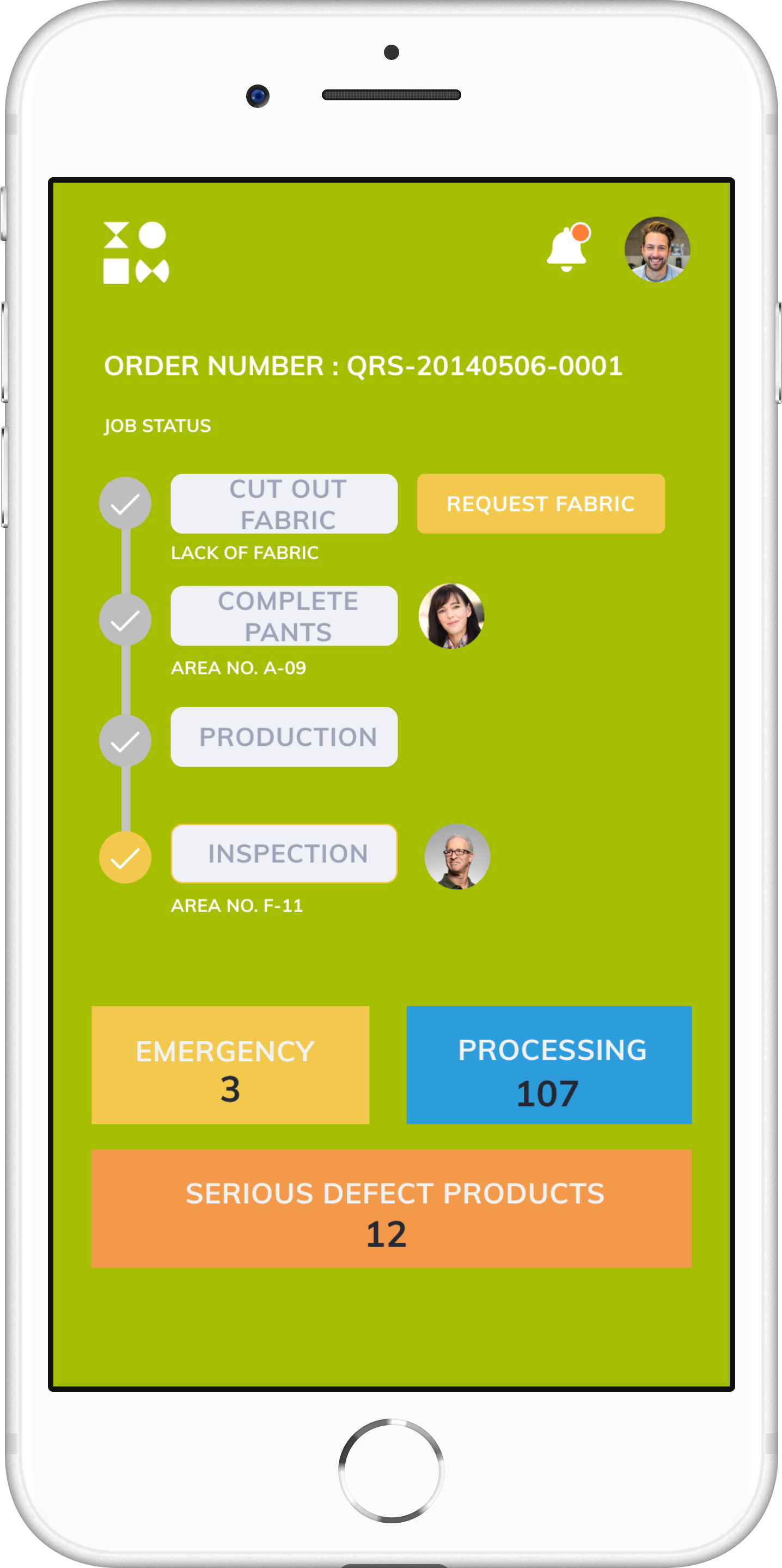
SOLUTION3| OVERALL SITUATIONAL ALARM
Support mobile service for mobilty environment
Task Mobile App. to check work status
Support mobile service for mobilty environment
LEARNINGS
I was trying to hear customer’s real voices. Especially, we had a section of workshop participating each stakeholder. That was very perfect to figure out root causes from many problems. We can get things to what we didn’t know through our research.

CLIENT
KOMEDIAI, Inc
MY ROLE
KOMEDIAI, Inc
MY ROLE
Chatbot UX Consulting
Conversation Design
SUMMARY
YEAR
I lead medical tourism chatbot platform service project in KOMEDIAI, which serves mongolian tourists.
YEAR
2020

PROBLEM STATEMENT
“ Many medical tourists depend on people around them and agency to take a medical in Korea. There is nothing to serve qualified information to tourists. They need to a platform to use these information and reserve hospital in Korea themselves.”
PROJECT GOALS
1
Build AI chatbot to communicate multi languages without installing messenger or apps
2
Recommended customized service based in behavior-predictation
3
Deliver One-stop medical tourism service to book hospitals and trips at once
4
Support aftercare service and guide next reservation
APPROACH
︎Conduct a survey for medical tourists
︎ Interview medical tourists and stakeholders
︎ Check issue points betwen medical tourists and medical coordinators
︎Conduct a survey for medical tourists
︎ Interview medical tourists and stakeholders
︎ Check issue points betwen medical tourists and medical coordinators
RESEARCH METHODS

Field Research
In-depth Interview
User Survey
INTERVIEW OVERVIEW 🔎️
1. INTERVIEWEES : Total 2 interviewees (Medical Tourism Coordinator, Medical Tourist)
2. INTERVIEW PERIOD : 2020.09.10~2020.09.11 (2 days)
3. INTERVIEW METHODS : In-Depth-Interview
4. INTERVIEW POINTS :
✔︎ Check user behavior about previous service for medical tourists
✔︎ Check main painpoints spot of medical tourism
✔︎ Check medical tourism coordinator’s role and responsibility
2. INTERVIEW PERIOD : 2020.09.10~2020.09.11 (2 days)
3. INTERVIEW METHODS : In-Depth-Interview
4. INTERVIEW POINTS :
✔︎ Check user behavior about previous service for medical tourists
✔︎ Check main painpoints spot of medical tourism
✔︎ Check medical tourism coordinator’s role and responsibility

User Journey Map
PAIN POINTS & KEY FINDINGS
︎ Do not sufficent Medical Information in Korea
︎ Feel fatigue by contacting frequently with agent and medical coordinator
︎ Lack of travel experience and information in Korea
︎ Do not sufficent Medical Information in Korea
“I always ask my friends who took surgery in Korea before. which hospital is good, how costs to take the surgery.”
︎ Feel fatigue by contacting frequently with agent and medical coordinator
“I contact coordinator by phone call or messenger whenever I have something to ask.”
︎ Lack of travel experience and information in Korea
"I want to go to some places like Jeju island but hard to find travel information. So, I usually go to pharmacy to shop popular items in Korea."
︎ Not perform follow-up service
“Hospital in Korea sent messages by KaKao Talk after clinic and cautious information but, we can't receive messages in local. So, I make a call or send messages by viber to ask something."
︎ Not perform follow-up service
“Hospital in Korea sent messages by KaKao Talk after clinic and cautious information but, we can't receive messages in local. So, I make a call or send messages by viber to ask something."
SOLUTIONS
1
Self simple reservation based in personalized curation
2
Simple UI to connect seamless conversation experience
3
Notification in every in time for Next step
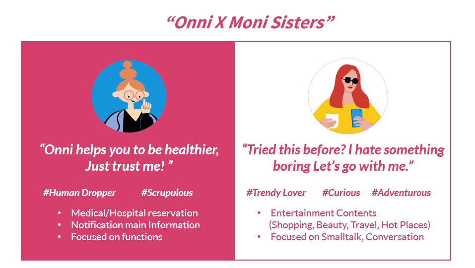
USER PERSONA

BOT PERSONA
SOLUTION1| Personalized Curation
![]()
Personalized Quiz to recommend medical service
Deal with issue through sharing detail tasks status and assistance
SOLUTION2| Simple UI to select quickly
![]()
Sliding layer popup ui to help seamless task
Enabled to confirm complicated information at once on chatbot interface
SOLUTION3| OVERALL SITUATIONAL ALARM
Send nofitication message when to do next stage![]()
Remind Bot Notification in timely
Send nofitication message when to do next stage


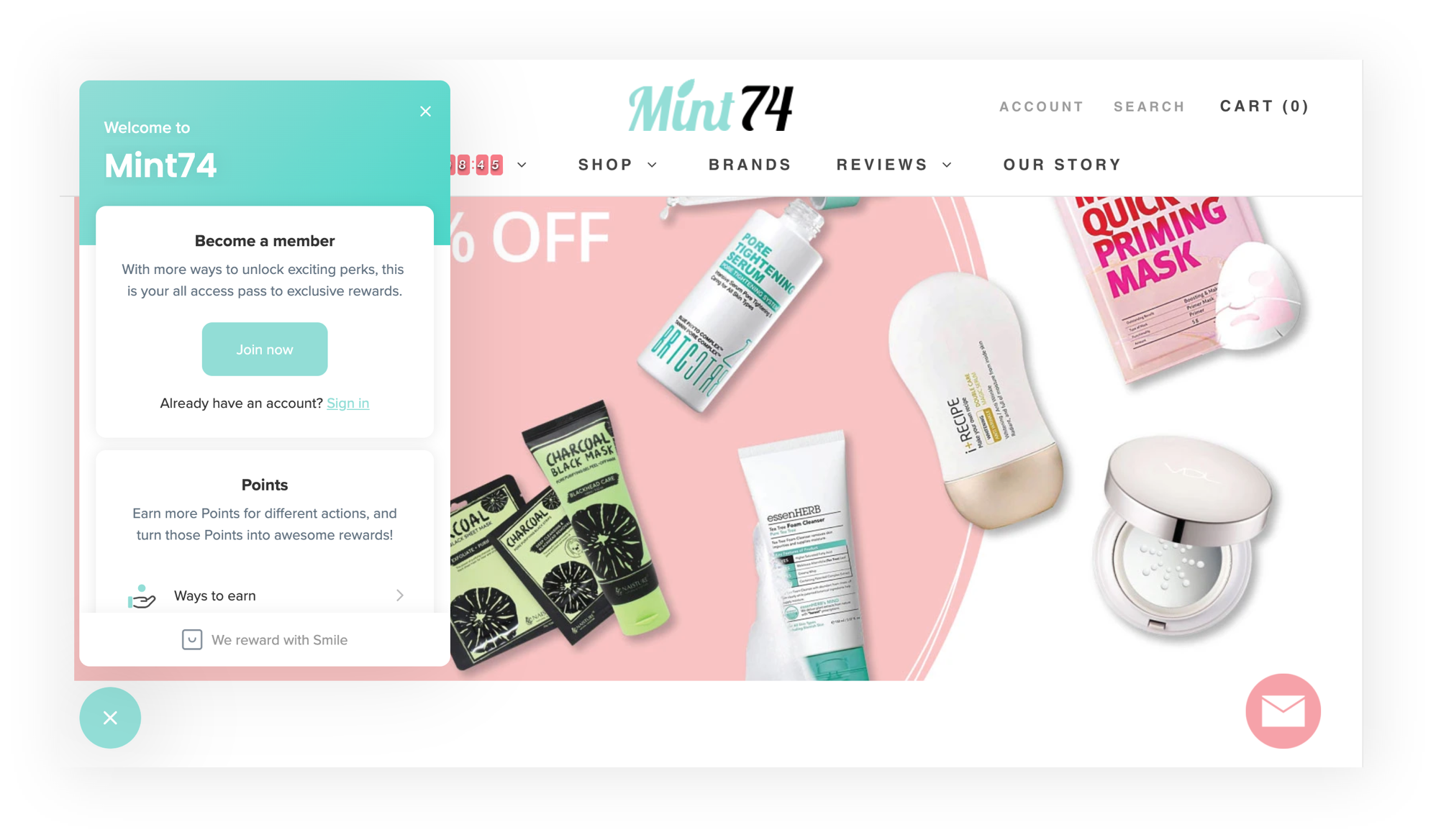
BRAND
Mint74
MY ROLE
Branding
Mint74
MY ROLE
Branding
UX Design
SUMMARY
YEAR
I lead renewal design on Mint74 E-commerce site, which is, K-beauty online mall combined Influencers.
YEAR
2019

PROBLEM STATEMENT
“ Mint74 is one of the deal sites. The site has bad usability especially on Mobile. So customer retention rate on the site is super low. This brand wants to expand K-beauty ecommerce website with brand identity. ”
PROJECT GOALS
1
Redesign K-beauty ecommerce website
2
Build a branding for ‘K-Beauty’
3
Make influencer’s review eco-system
4
Easy-to-use shopping experience
APPROACH
︎ Analysis sales reports and customer reivews on Amazon
︎ Analysis E-commerce site trend and products
︎ Analysis sales reports and customer reivews on Amazon
︎ Analysis E-commerce site trend and products
RESEARCH METHODS

Customer Review Analysis
Competitor Research
PROBLEM STATEMENT
︎ Do not build ecommerce website brand identity
“It’s like one of the deal sites.”
︎ Bad usability especially on Mobile
“It’s like instagram not commerce sites”
︎ Super low customer retention rate
“Come to visit only cheapest prices.”
︎ Do not build ecommerce website brand identity
“It’s like one of the deal sites.”
︎ Bad usability especially on Mobile
“It’s like instagram not commerce sites”
︎ Super low customer retention rate
“Come to visit only cheapest prices.”
SOLUTIONS
1
Layout to Fit in Shopper’s Mental Model
2
Make Brand Identity Who We Are
3
Strong Real Reviews With Influencers
4
Simplify Contents & Intuitive UI
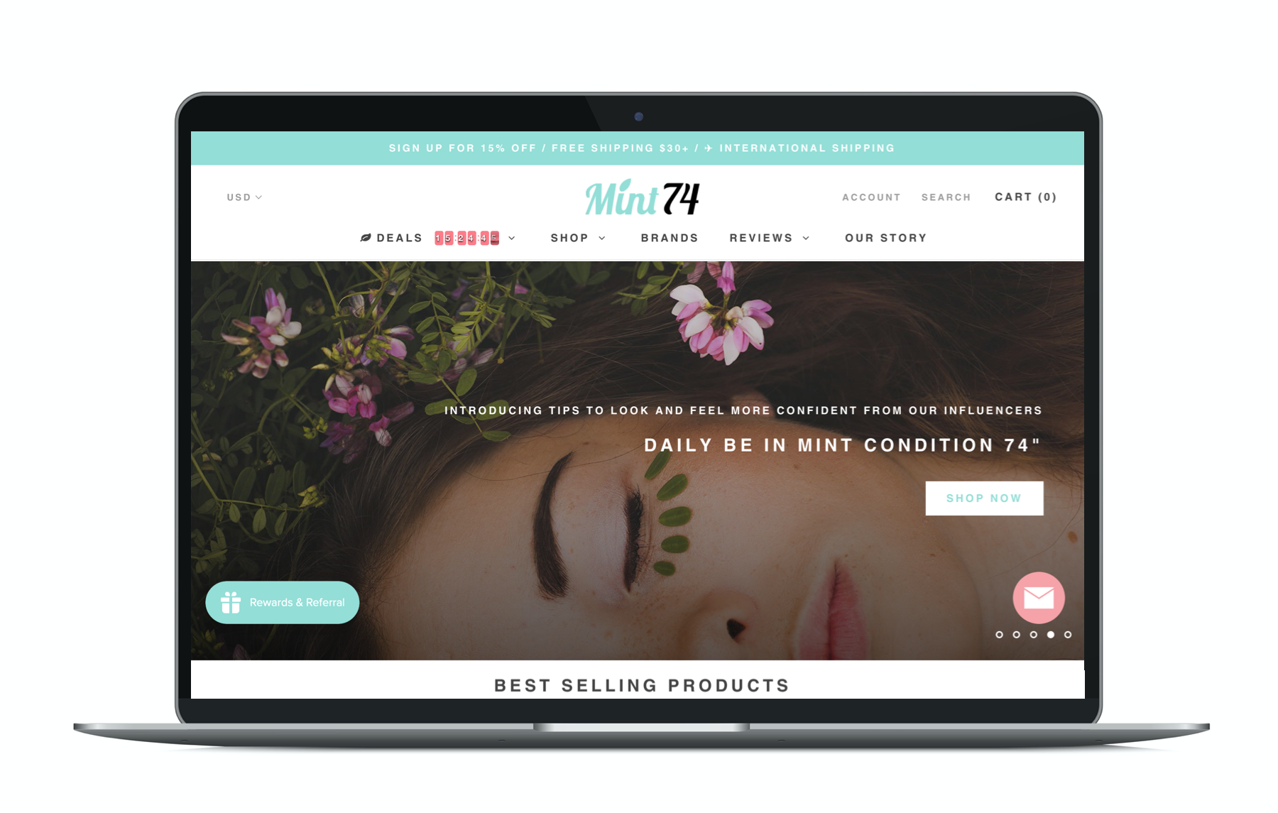
SOLUTION #1| LAYOUT TO FIT IN SHOPPER’S MENTAL MODEL
Consistent E-commerce experience
Follow standard E-commerce UX : Mega Menu, Hero Images, Best-selling items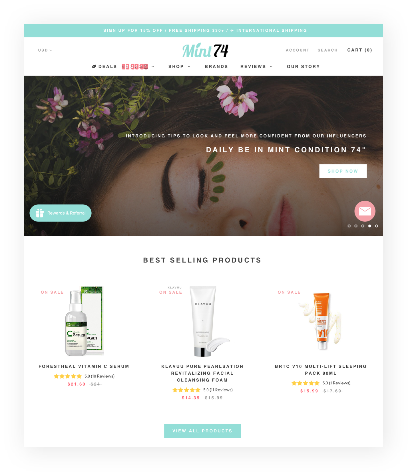
Main Page
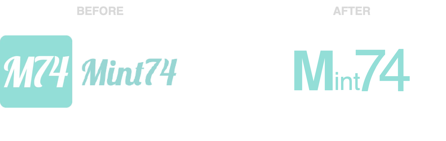
SOLUTION2| MAKE BRAND IDENTITY WHO WE ARE
Cover Branding on site
Give the site Brand identity which is unique personality and different pointBrand Messege
“ Daily be in mint condition 74s ”
“ Daily Time to be beautiful Mint74s ”
Brand Identity

Why Mint74?
A place where to get real voice of K-Beauty
Focused on service shorten video contents(7s, 74s)
1. Product Image -> Product Video(7s Gif)
2. Product Video -> Influencer Review Video (74s)
3. Text based Blogs -> Video based K-beauty Tips
Brand Concept
Thinner than before
Less than before
Minimized Information
Dynamic Information
Logo Type
Brand Story Who We Are
Make our own Story for retain initial customers

SOLUTION #3| STRONG REAL REVIEWS WITH INFLUENCERS
With Influencers
Serves quilified reviews and information like product’s tips with influuncers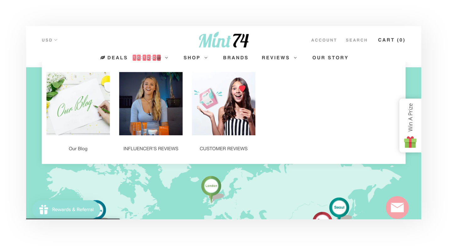
Mega Menu (GNB) - REVIEWS

Main Page - INFLUENCER’s Pick
SOLUTION #4| SIMPLIFY CONTENTS & INTUITIVE UI
Minimized Steps
Go straight into next steps through serving buttons
Sign UP / Cart (Mobile)
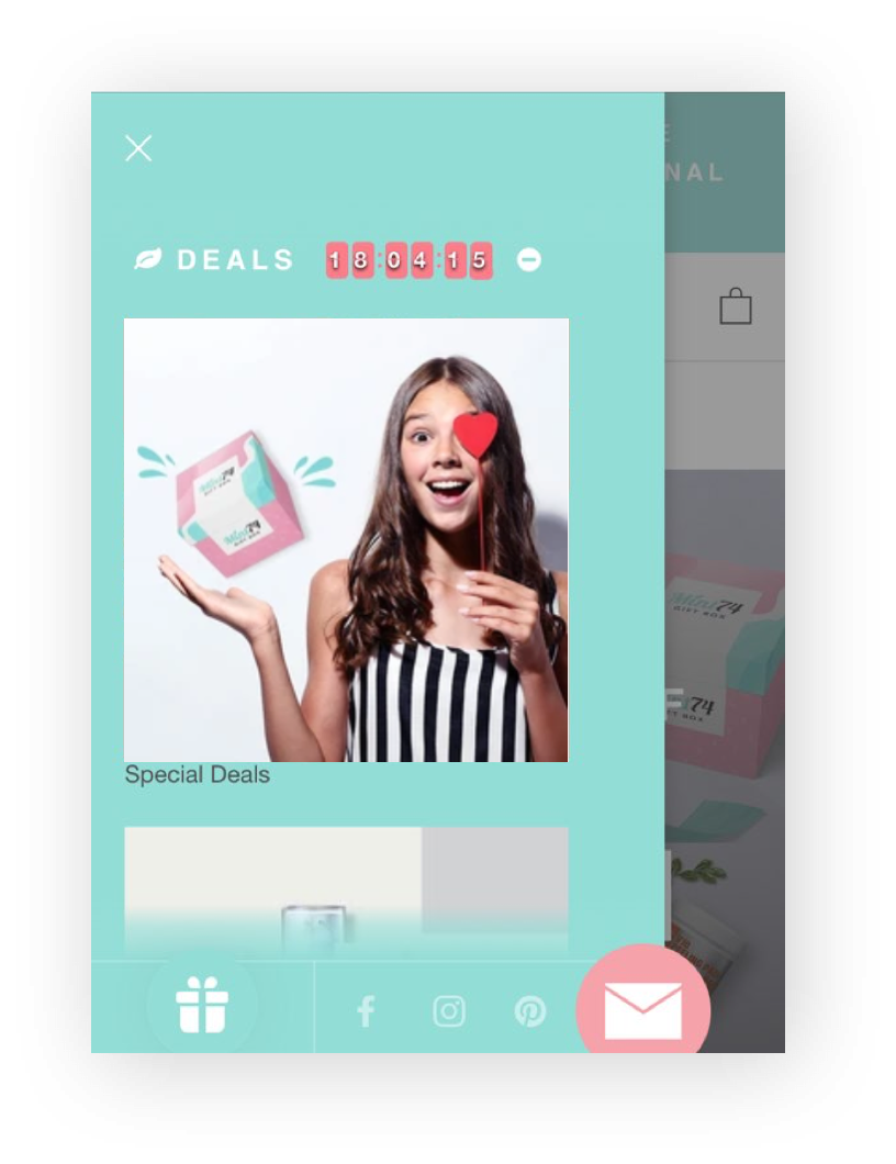
MENU (Mobile) - Deals
Home - Rewards&Points Layer Popup
ACHEIVEMENTS
- Increase Sales Revenue over 5x
- Acquire New Customer over 20%
LEARNINGS
This is a very exciting project for me to understand brand e-commerce website. It’s very important not only a fancy website but also digital marketing to take place sales. I’m focused on making eco-system between influencers and products. It is not only e-commerce sites to sell products, but deliver trust product information to customers.
BRAND
Rael
MY ROLE
Amazon Contents Design
WORK WITH @SANDY.CHO
VISUAL DESIGN
Rael
MY ROLE
Amazon Contents Design
WORK WITH @SANDY.CHO
VISUAL DESIGN
SUMMARY
YEAR
I redesign product contents design and brand store pages on Amazon.
YEAR
2018


PROBLEM STATEMENT
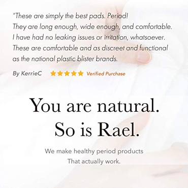
“ Most of amazon users are shopping by phone. But Rael contents on Amazon are not suitable on mobile environment. It contains too many things, even text information. It is hard to figure out what the product benefits are quickly.”

BEFORE PRODUCT DETAIL PAGE IMAGES
PROJECT GOALS
1
Build consistent contents standard about every product lines on Amazon
2
Help user to intuitive understand by enhancing images contents
3
Boost conversion rate by improving contents
4
Enhance brand image by organizing based in storytelling contents
RESEARCH METHODS

Customer Review Analysis

Desk Research
PAIN POINTS
︎ Not easy to catch product information written small text especially on mobile
︎ Just listed product image without elements to make customers be attracted
︎ Hard to deliver to customers how to use products by only text and fixed images
︎ Not easy to catch product information written small text especially on mobile
︎ Just listed product image without elements to make customers be attracted
︎ Hard to deliver to customers how to use products by only text and fixed images
SOLUTIONS 💡️
1
Establish Amazon contents process
2
Improve product images focused on function and feature
3
Make contents based in Storytelling
4
Build new brand store front pages
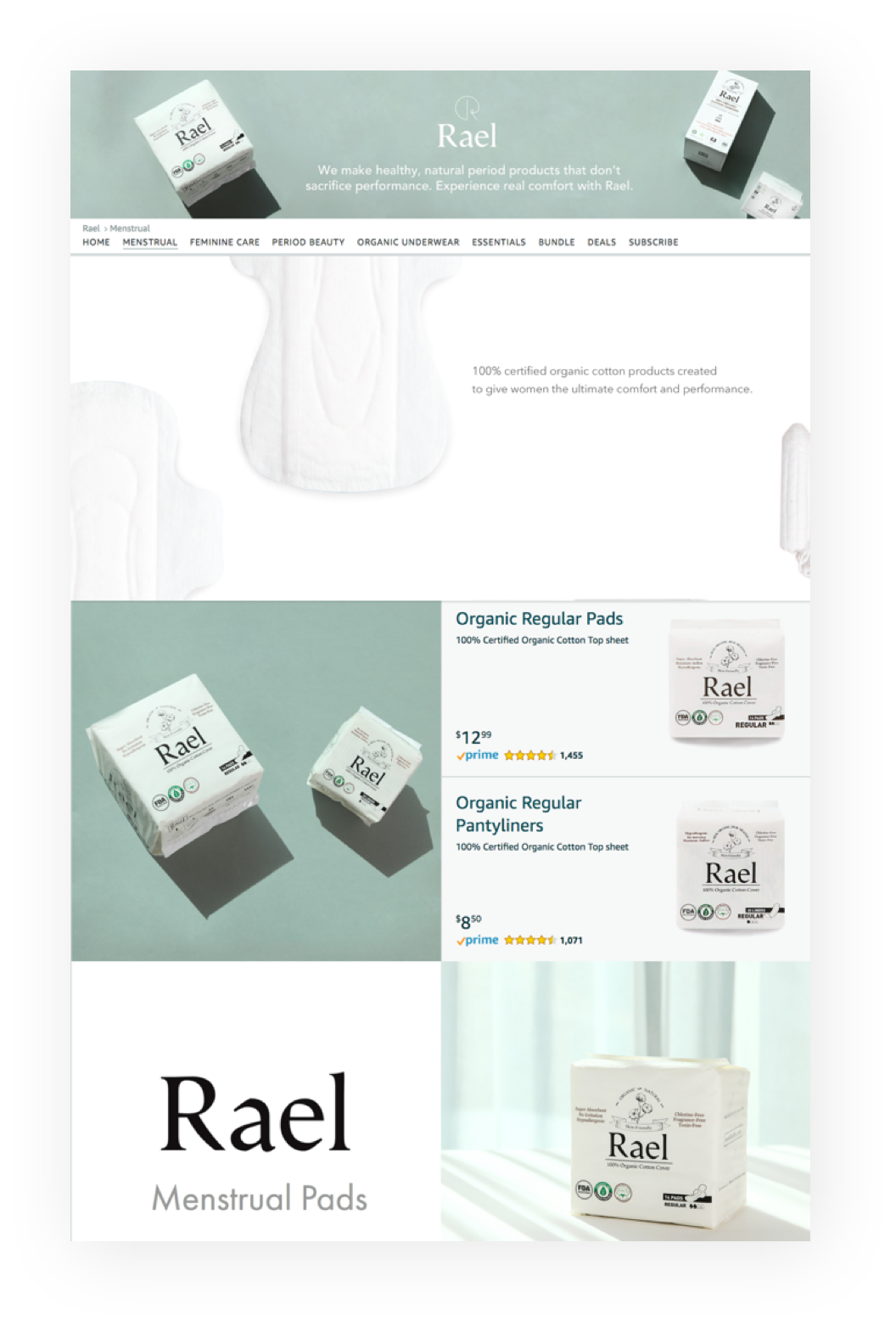
SOLUTION1| REBUILD AMAZON CONTENTS PROCESS
![]()
7 steps product page process
Build contents standard focused on product feature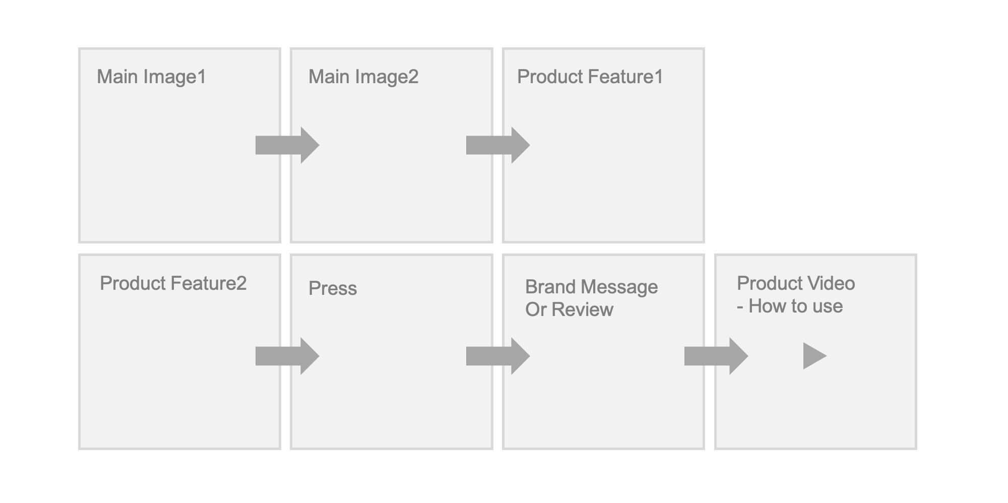


SOLUTION2| IMPROVE PRODUCT IMAGES FOCUSED ON FUNCTION AND FEATURE
Proactive Images
Focus on sproduct inner shape and feature instead of product package image

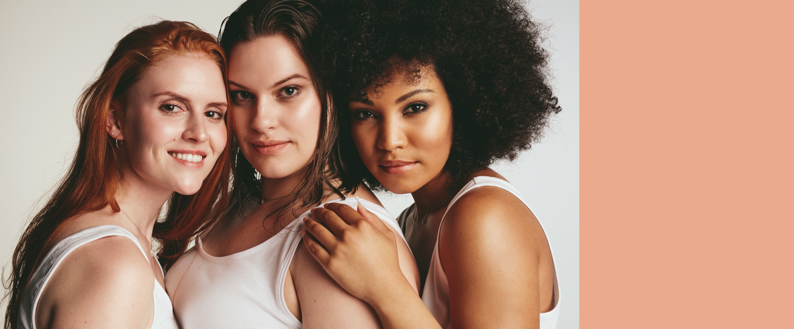
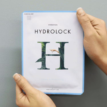
SOLUTION3| MAKE CONTENTS BASED IN STORYTELLING
Make “Period Beauty” story contents for worried women when to go through period
Storytelling for Period Women
Make “Period Beauty” story contents for worried women when to go through period

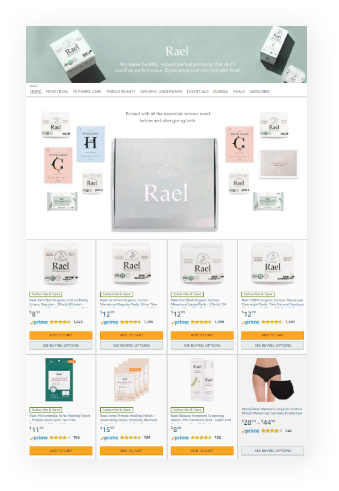
SOLUTION4| BUILD NEW BRAND STORE FRONT PAGES
Make new point of entry to boost sales with image elements
Product Collection With Brand Story
Make new point of entry to boost sales with image elements
ACHEIVEMENTS
Increase over 10% sales on Amazon
LEARNINGS
Customers tend to acquire active contents it’s because they aren’t able to see product detail information online directly. We have focused on outer package so far. We are trying to visualize inner shape and detail product feature after we figured out customer’s needs.

BRAND
Rael
MY ROLE
Product Design
WORK WITH @SANDY.CHO
VISUAL DESIGN
Rael
MY ROLE
Product Design
Product Production
WORK WITH @SANDY.CHO
VISUAL DESIGN
SUMMARY
YEAR
I lead the renewal product package design at Rael, which is an organic and natural feminine care brand.
YEAR
2018
PROBLEM STATEMENT
“ Rael has 2-category product lines as organic menstrual care and natural beauty care. But each package has been designed based on their own concept. Also, competitior products covered in white color are also similar-looking. Rael needs to have its own unique brand identity to integrate packaging. ”


PROJECT GOALS
1
Redesign package of its melted brand identity
2
Define a packaging design based on principles and standards
3
Deliver product contents for customer’s convenience
4
Enhance a global brand loved by health-conscious millennials
APPROACH
Package features on Online & Offline Market (Amazon, Website, Target)
Real voice customer reviews & CS data for each channel (Amazon, Websites)
Interests & features millennials as the target customer
Package features on Online & Offline Market (Amazon, Website, Target)
Real voice customer reviews & CS data for each channel (Amazon, Websites)
Interests & features millennials as the target customer
RESEARCH METHODS

Customer Review Analysis

Market Research Analysis

Package Prototype testing

Field Research

Research Results
PAIN POINTS & KEY FINDINGS
︎ It’s hard to recognize product-subcategory & size on Amazon & website when doing the search
︎ Offline markets such as Target and Walmart are key venues to display package size and shape.
︎ Target customers are mainly interested not only in product quality but also in brand philosophy as like being eco-friendly
︎ It’s hard to recognize product-subcategory & size on Amazon & website when doing the search
“Only photos, double-check the information
if the product is the right size or not🔎️”
if the product is the right size or not🔎️”
︎ Offline markets such as Target and Walmart are key venues to display package size and shape.
“It feels like, not attracting our attention among other goods on the store.”
︎ Target customers are mainly interested not only in product quality but also in brand philosophy as like being eco-friendly
“Organic Lovers also think of the envirionment.🌎️”

Listing Product on Amazon
SOLUTIONS
1
Cover Oranic & Natural Brand Identity
2
Build Package Design Principle & Standard
3
Develop custom-product and enhance the function
4
Go Green Everything we made
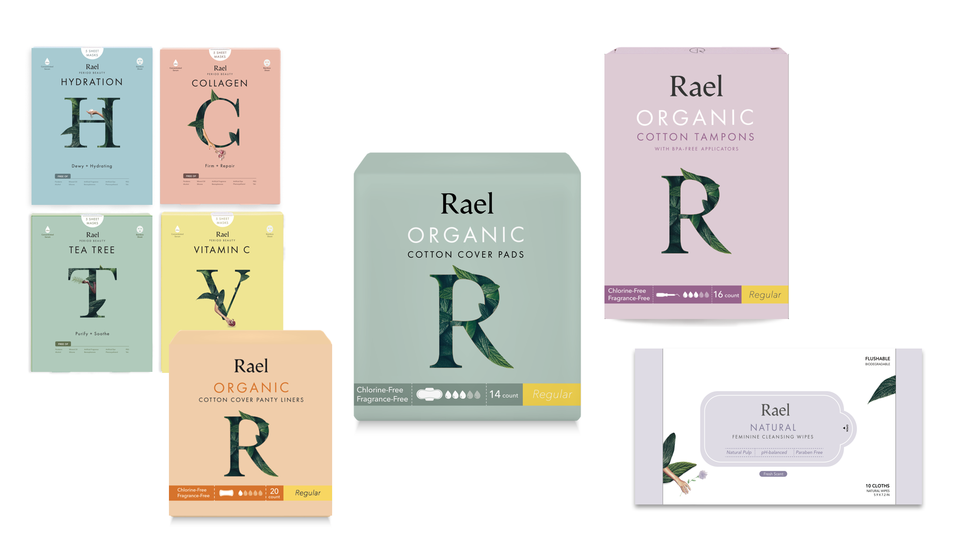
SOLUTION 1| COVER ORGANIC & NATURAL BRAND IDENTITY
The shape of the symbol ‘R’
Impress fresh and natural feelings through Symbol ‘R’
Brand Tone & Manner
Impact powerful wording and memorable messaging.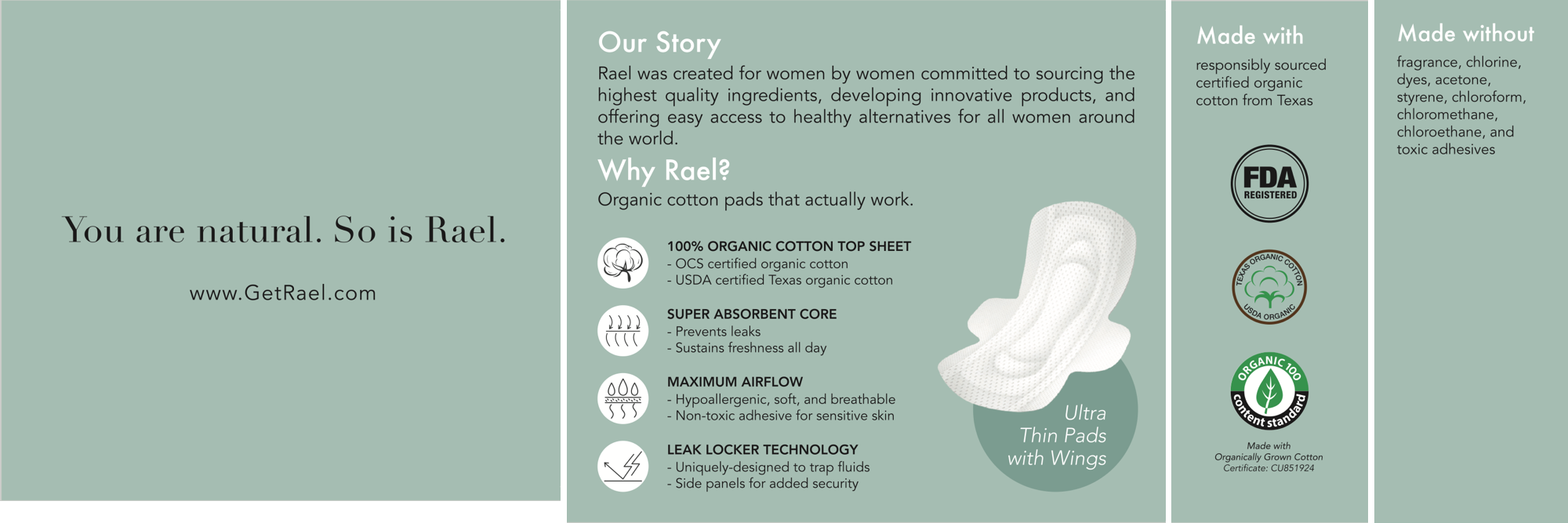
SOLUTION 2| BUILD PACKAGE DESIGN PRINCIPLES & STANDARD
Formulate color system of each product line : product, size label
Color system
Formulate color system of each product line : product, size label
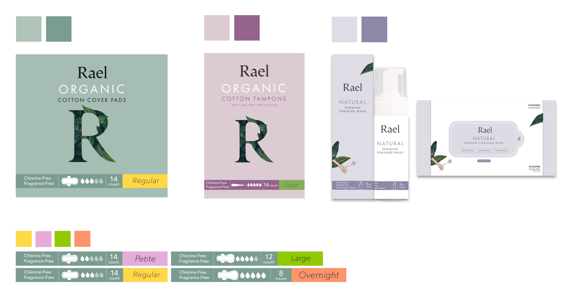
Iconography
Express product detailed information making intuitive icon instead of text

SOLUTION 3| DEVELOP CUSTOM-PRODUCT AND ENHANCE FUNCTION
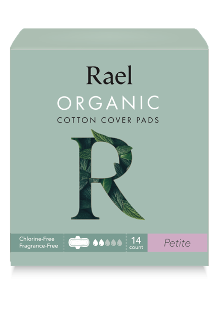
Release petite-sized pads for teenagers with the first period. Smaller but better function
For teenagers : Petite version.
Release petite-sized pads for teenagers with the first period. Smaller but better function

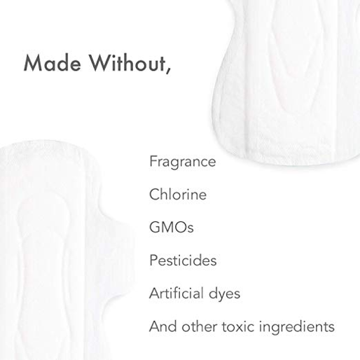
SOLUTION 4| GO GREEN WITH EVERYTHING WE MADE
Change packaging materials. Rael thinks of the environment.
Eco-friendly : From Vinyl to Papaer
Change packaging materials. Rael thinks of the environment.

ACHIEVEMENTS
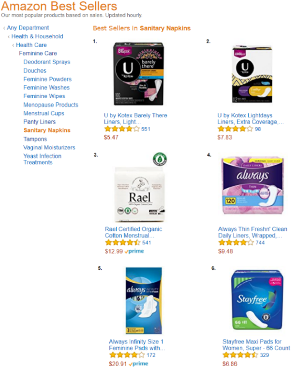
Entrance of the new package version of products into 1,800 target stores in the US
![]()

Read article by Chosun Biz
LEARNINGS
This is my first package design job. I’ve learned a lot of gaps between designing online and offline. It’s not easy to design a package considering both online and offline situations. There are several limited situations in printing out packages. We change colors several times for the final packaging. We go through experimental stages to get the packaging color we want for printing.
MAKE BETTER VALUE
JEONGHEUN LEE SEOUL, SOUTH KOREA.
JEONGHEUN LEE SEOUL, SOUTH KOREA.